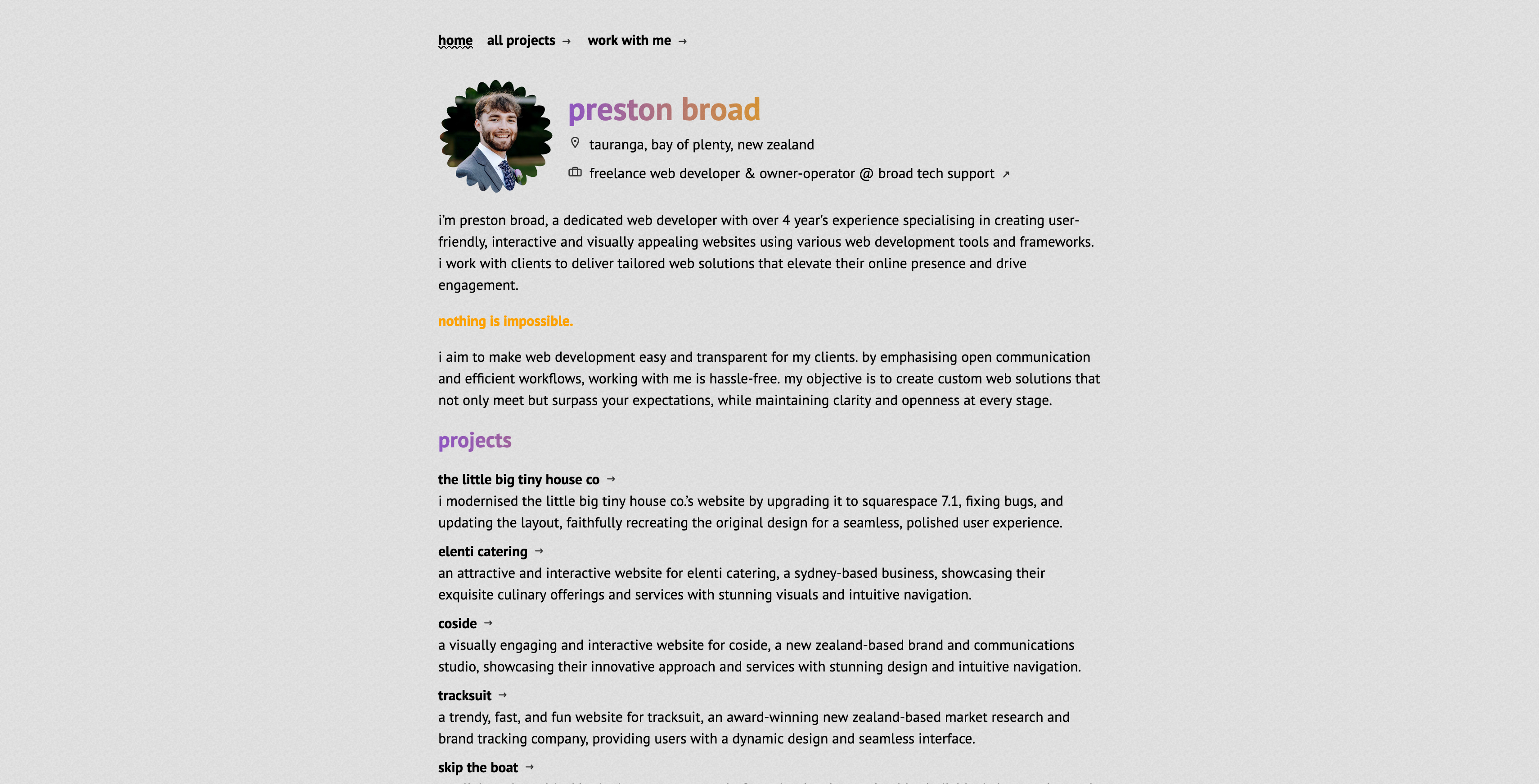
this portfolio
my own personal portfolio website showcasing my web development and design projects, with a focus on clean design, intuitive navigation, and seamless performance across devices.
jekyll, ruby, html, tailwind, css, javascript, github pages, vercel, google Analytics
Preston Broad
Preston Broad
Creating a personal portfolio is more than just assembling a collection of work—it’s about building a digital space that reflects your skills, style, and attention to detail. For my portfolio, I wanted a site that was not only visually appealing but also functional, intuitive, and fast. Here’s how I built it and the key features that make it stand out.
the Tech Stack
My portfolio is built using a solid stack that includes Jekyll, Ruby, HTML, Tailwind, CSS, JavaScript, GitHub Pages, Vercel, and Google Analytics. This combination of technologies allowed me to create a static, responsive website that’s easy to maintain and quick to load.
Jekyll & Ruby: Jekyll provided the framework for generating static pages, making the site fast and secure. Ruby, the language Jekyll is built on, allowed me to customize the site to my specific needs.
Tailwind CSS: Tailwind was a natural choice for styling. Its utility-first approach allowed me to rapidly build custom designs without writing excessive custom CSS. Tailwind’s integration with Jekyll ensured that the site remained clean and easy to style.
JavaScript & GitHub Pages: JavaScript powers the dynamic features of the site, while GitHub Pages serves as the hosting platform. The deployment is handled through Vercel, which ensures the site is always live and performant.
key features
Custom-Built Comparison Slider: One of the standout features of my portfolio is the custom comparison slider. This allows visitors to see before-and-after images of projects, giving them a clear view of the impact my work has made. This slider was built from scratch, tailored to fit the design and functionality I envisioned.
Fancybox for Lightbox: To showcase project images in the best possible way, I integrated Fancybox for the lightbox functionality. It provides a smooth, visually pleasing way to display images in a larger format, enhancing the user experience.
Markdown Support: Since the site is built on Jekyll, markdown support was essential. This allows me to quickly and easily write and format content, keeping the focus on showcasing my work rather than on complex coding.
Static and Responsive: The site is static, which means it’s incredibly fast to load. But being static doesn’t mean it’s not flexible—the design is fully responsive, ensuring a seamless experience across all devices.
Tailwind with Jekyll: Using Tailwind with Jekyll was a key decision. It provided the design flexibility I needed while keeping the development process efficient. Tailwind’s utility classes made it easy to create a consistent design language across the site.
Efficient Project Page Creation with a Custom Gallery System
One of the challenges I faced was the need to efficiently manage and display images across multiple project pages. To solve this, I built a custom gallery system. Each project has a dedicated gallery folder, and the system automatically checks for images in that folder. This approach speeds up the creation of new project pages and ensures that the images are always displayed correctly.
Focused on Showcasing the Work
The core of this portfolio is the work itself. It was important to me that the design and functionality of the site didn’t overshadow the projects being showcased. Everything, from the quick-loading pages to the intuitive navigation, is designed to keep the focus on the work and make it easy for visitors to explore and understand what I do.
