the little big tiny house co
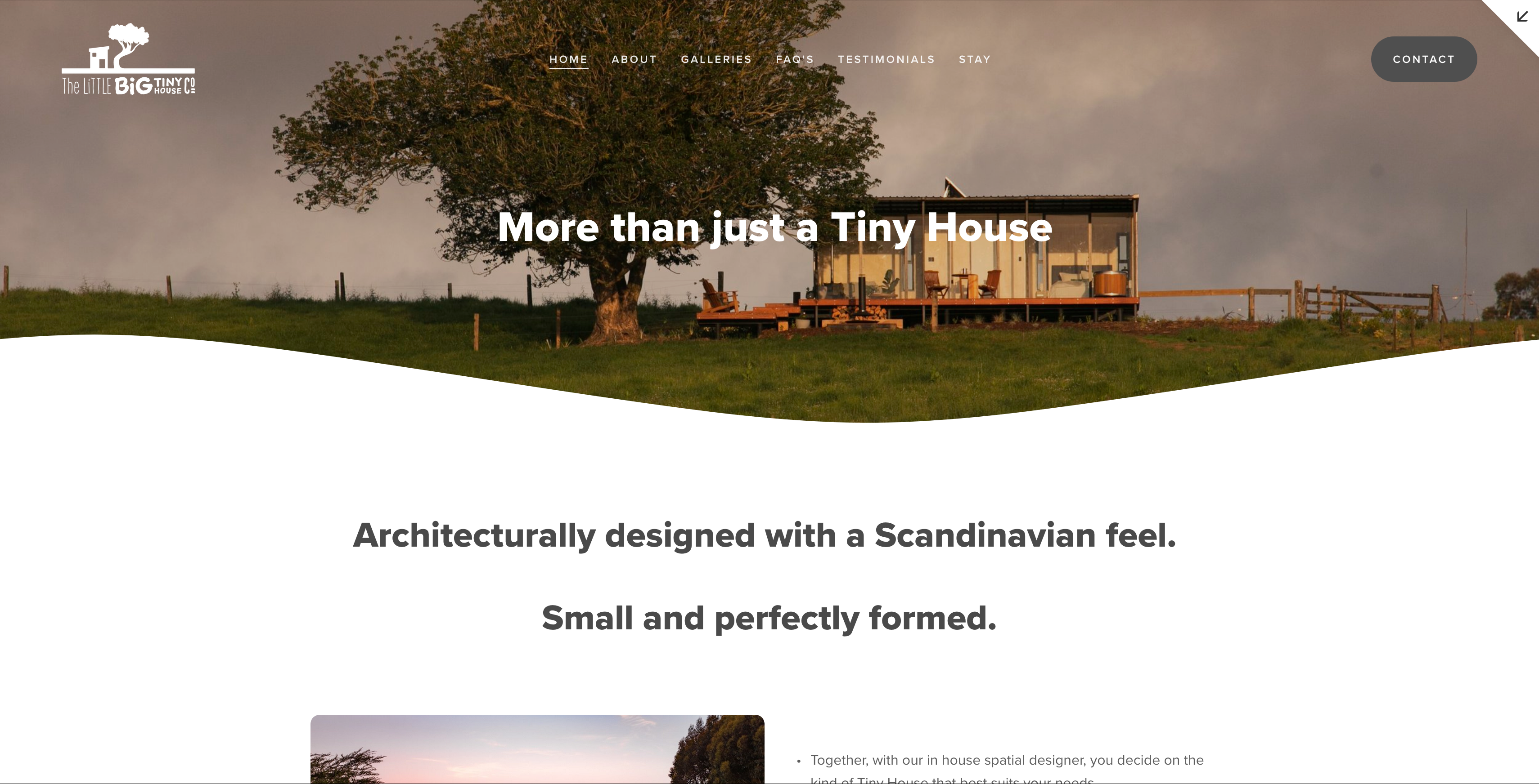
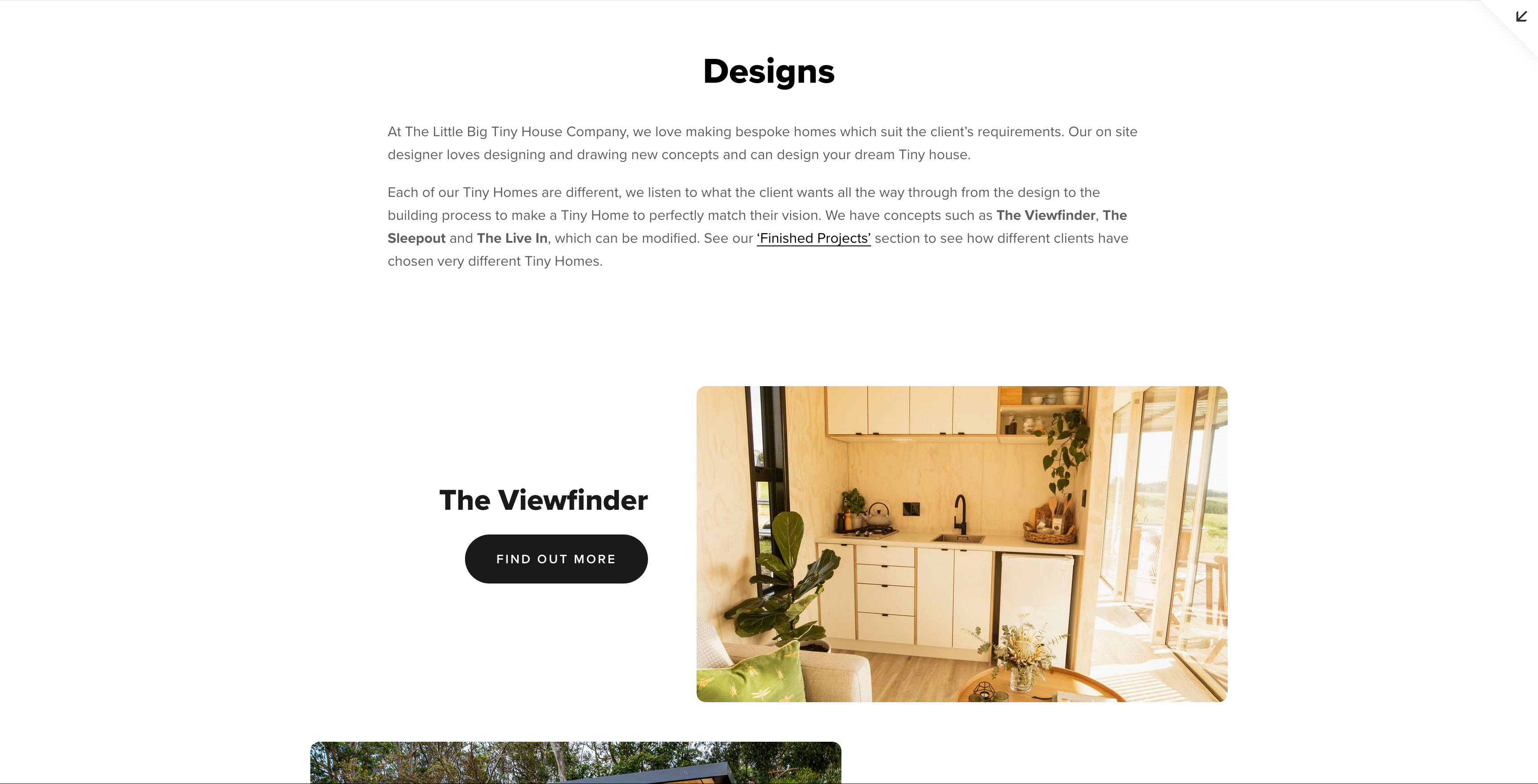
I modernised The Little Big Tiny House Co.’s website by upgrading it to Squarespace 7.1, fixing bugs, and updating the layout, faithfully recreating the original design for a seamless, polished user experience.
Squarespace, webflow, figma, Javascript, Google Analytics
Preston Broad
Preston Broad
I recently had the pleasure of working with Stefan, the director of The Little Big Tiny House Co., on a project to breathe new life into their website. The site needed some bug fixes and a general refresh, and I was more than happy to step in.
To bring the website up to date with the latest features, I upgraded it to Squarespace 7.1, taking full advantage of the new Liquid engine. In the process, I meticulously recreated the original site, adhering to web fundamentals and design best practices to deliver a seamless and polished user experience.
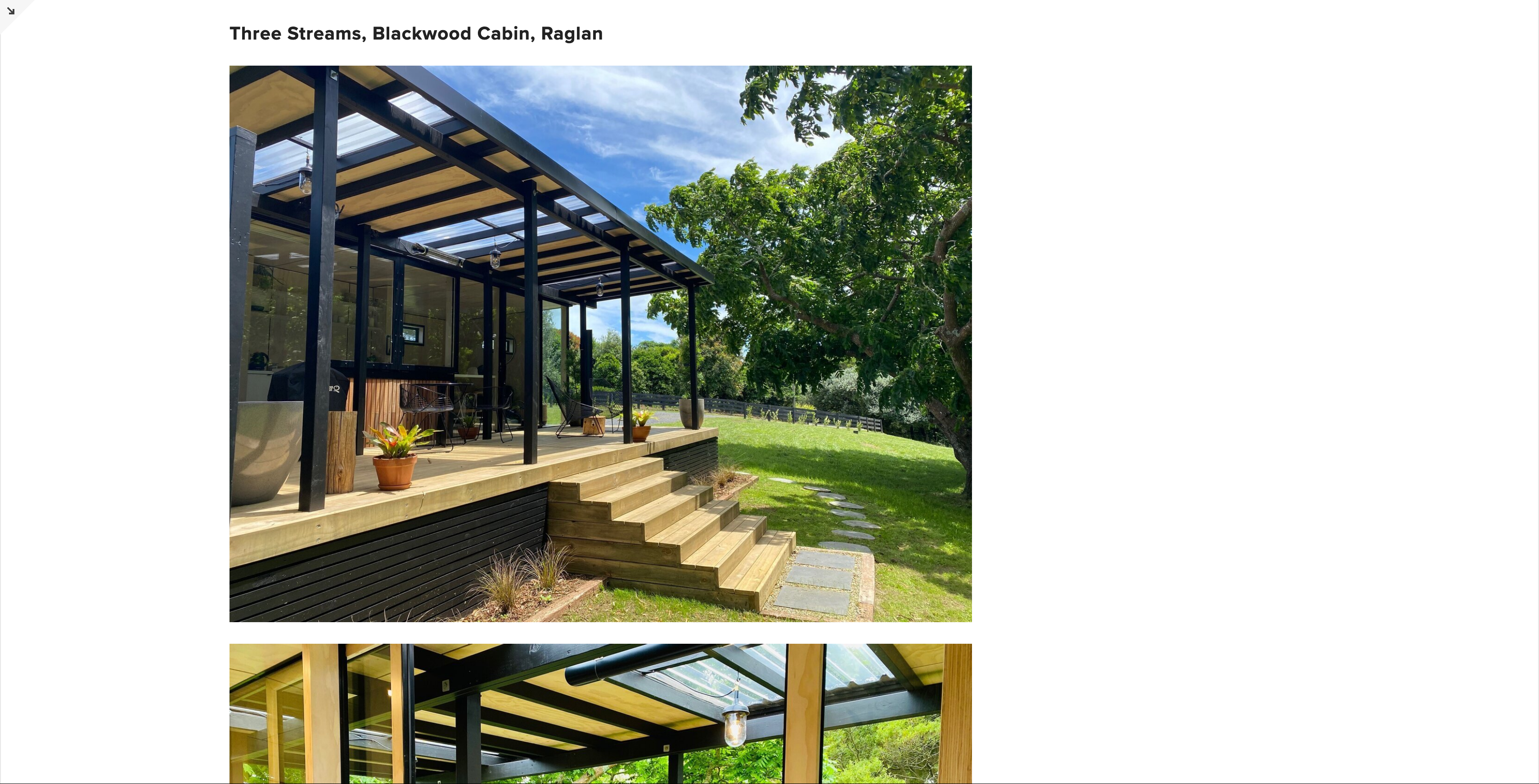
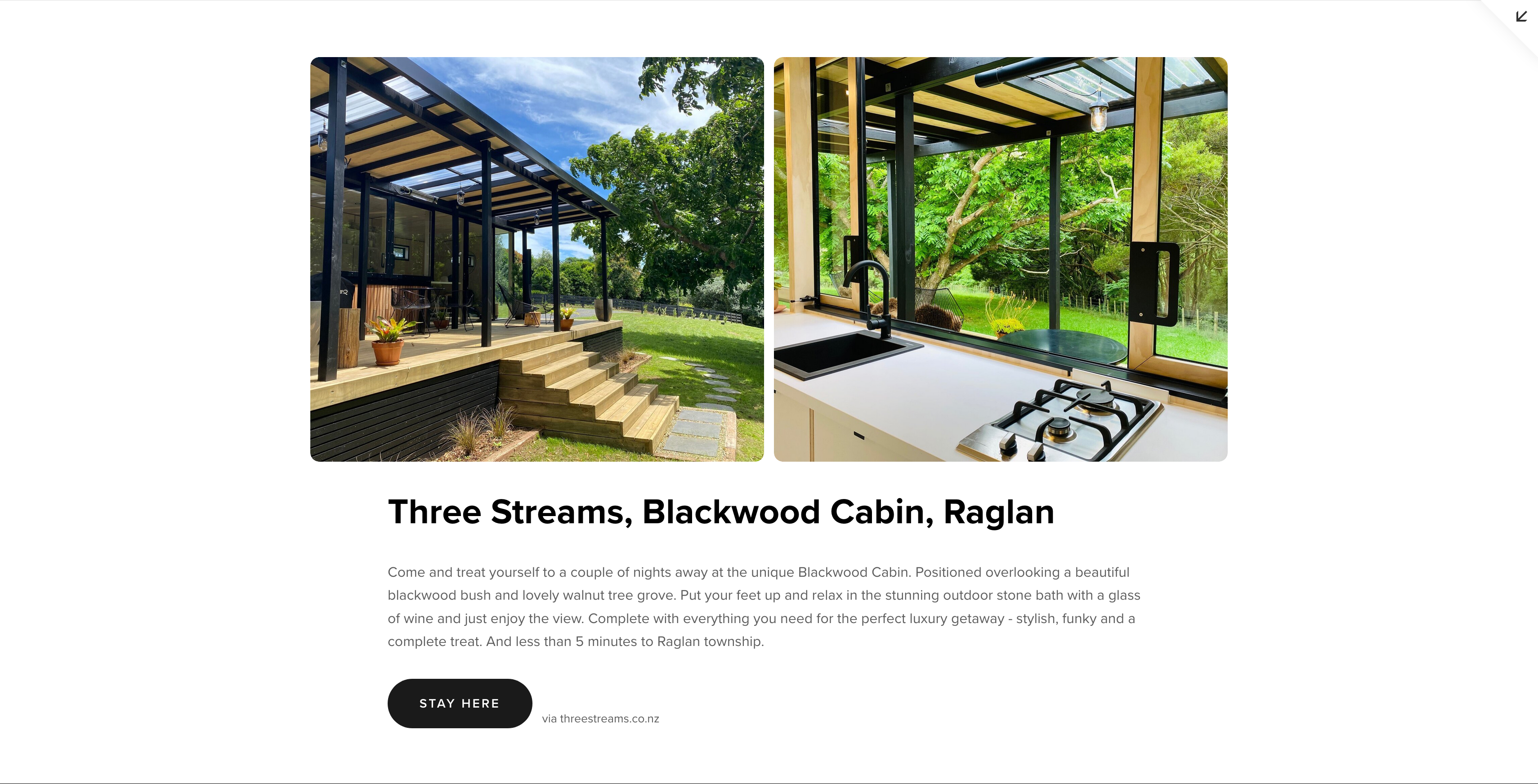
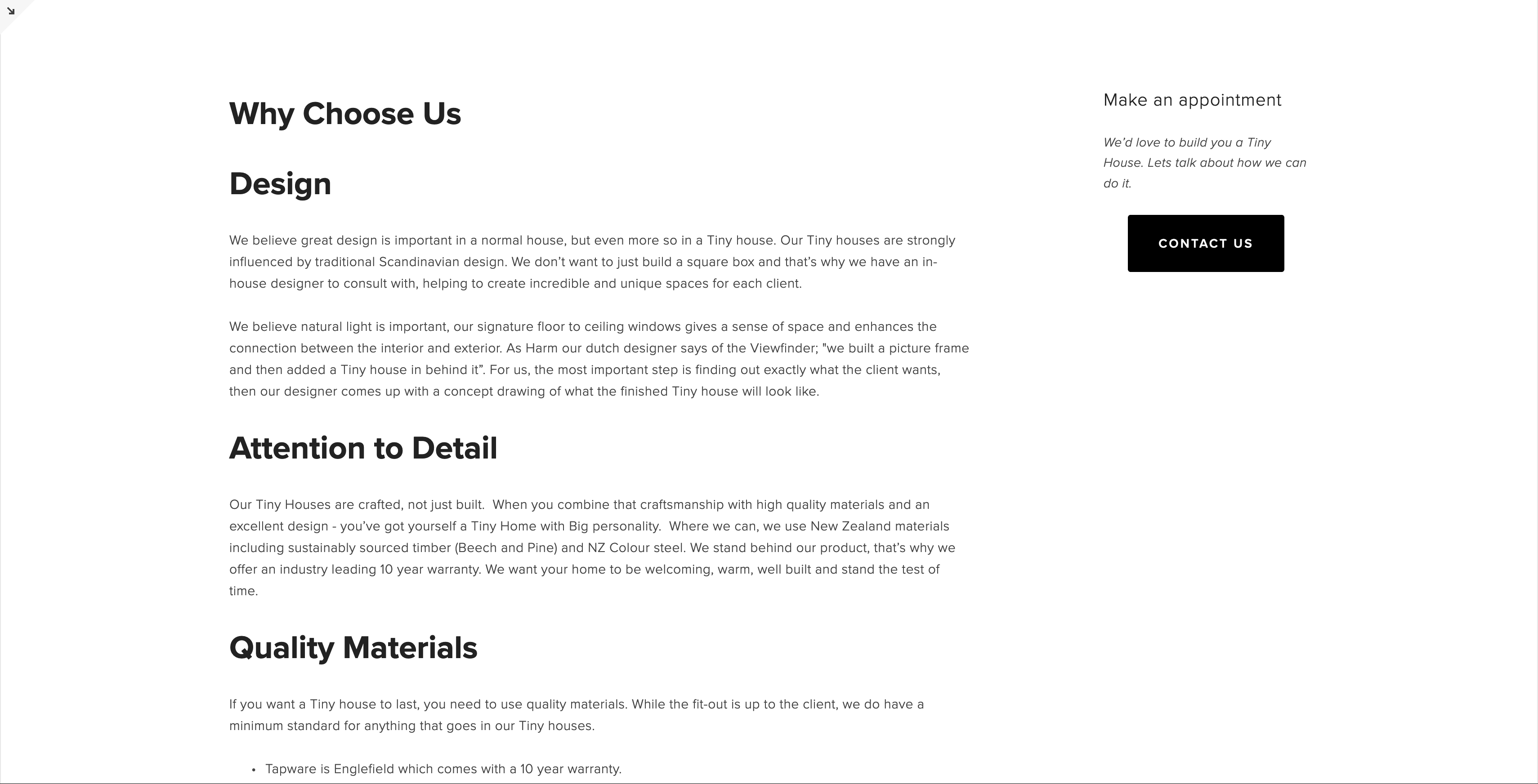
Below, you’ll find a series of before-and-after sliders that highlight the various sections of the site that were updated.
Just under the hero section, cleaner, more modern introduction to the company:
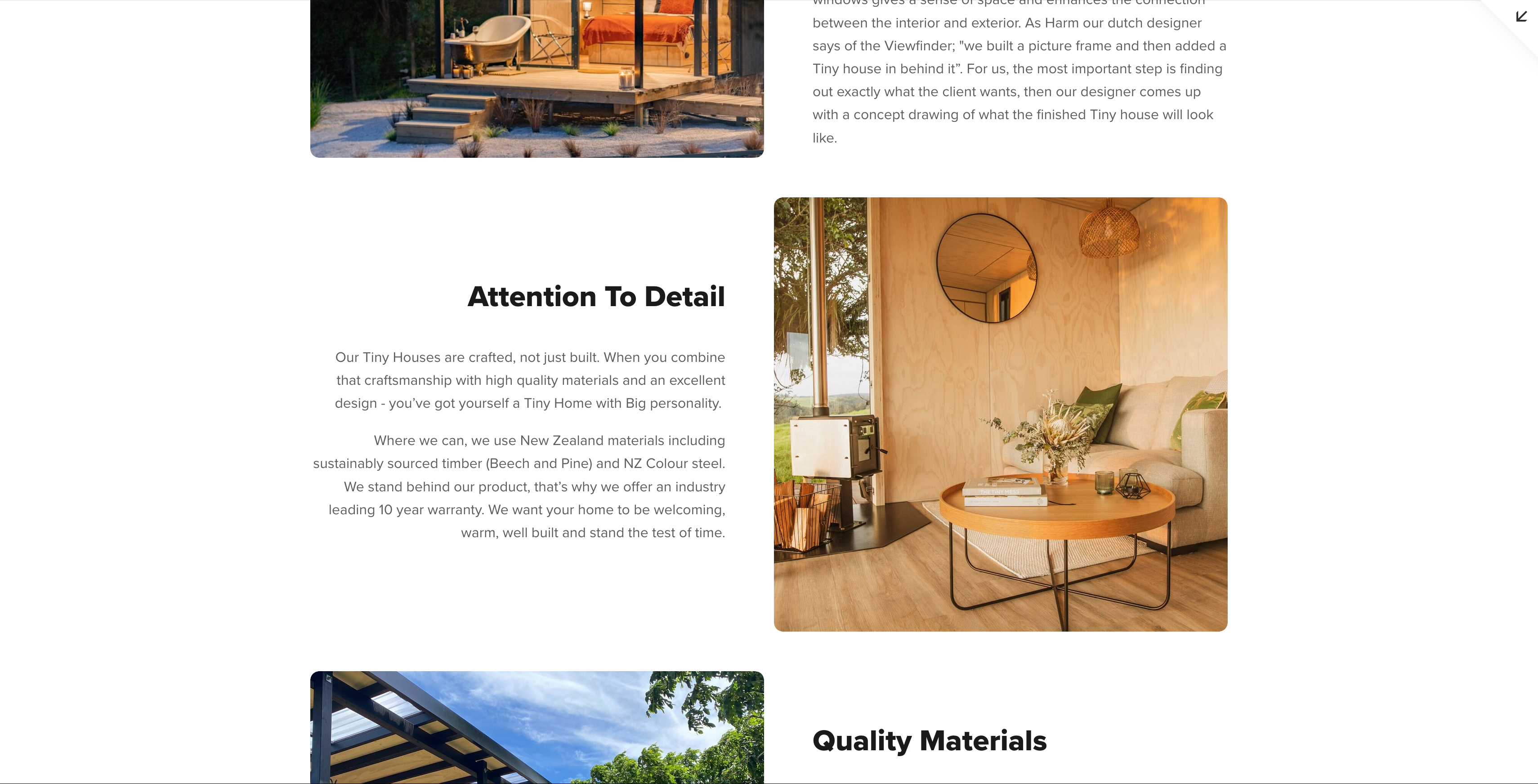
this is a part on the about page:
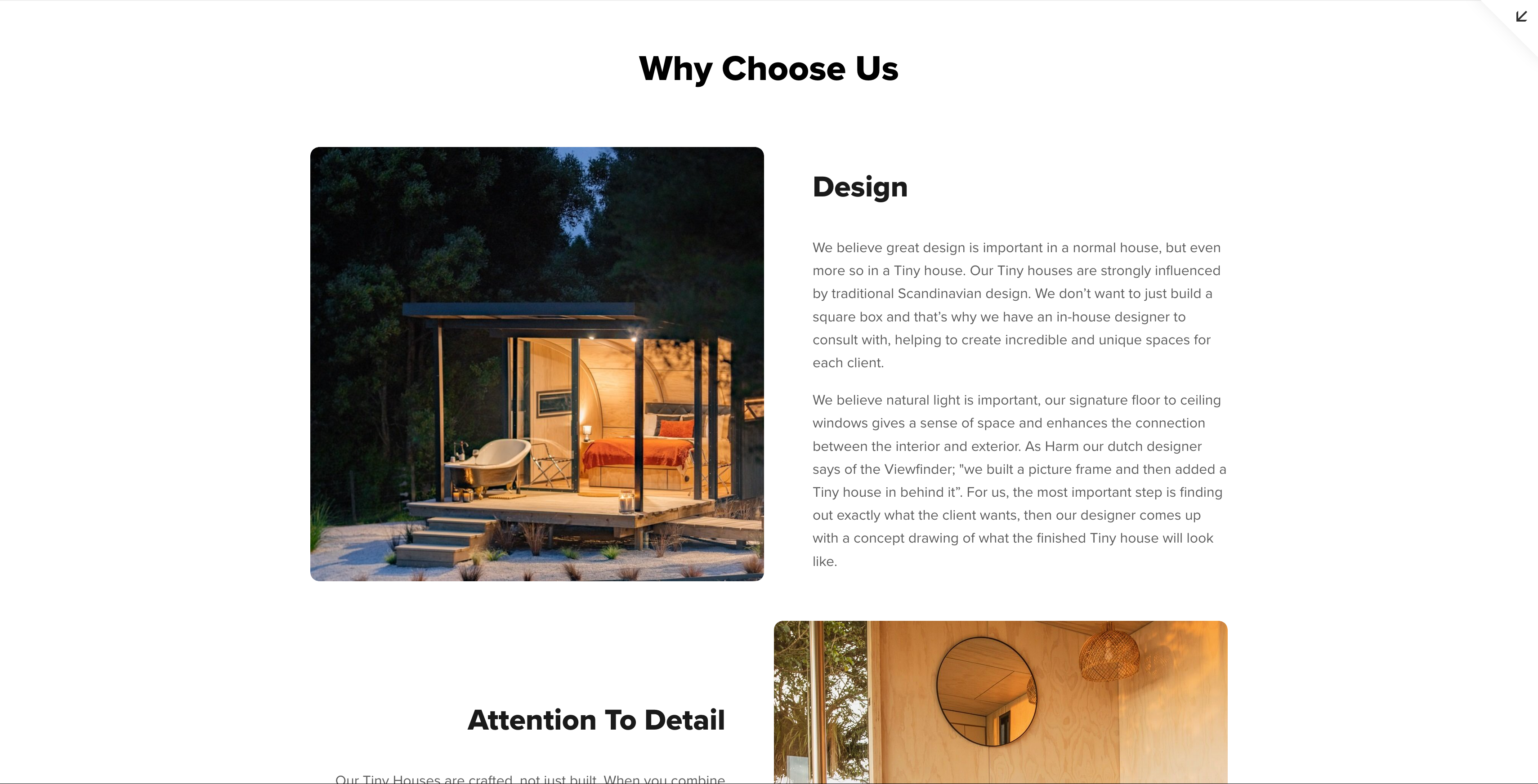
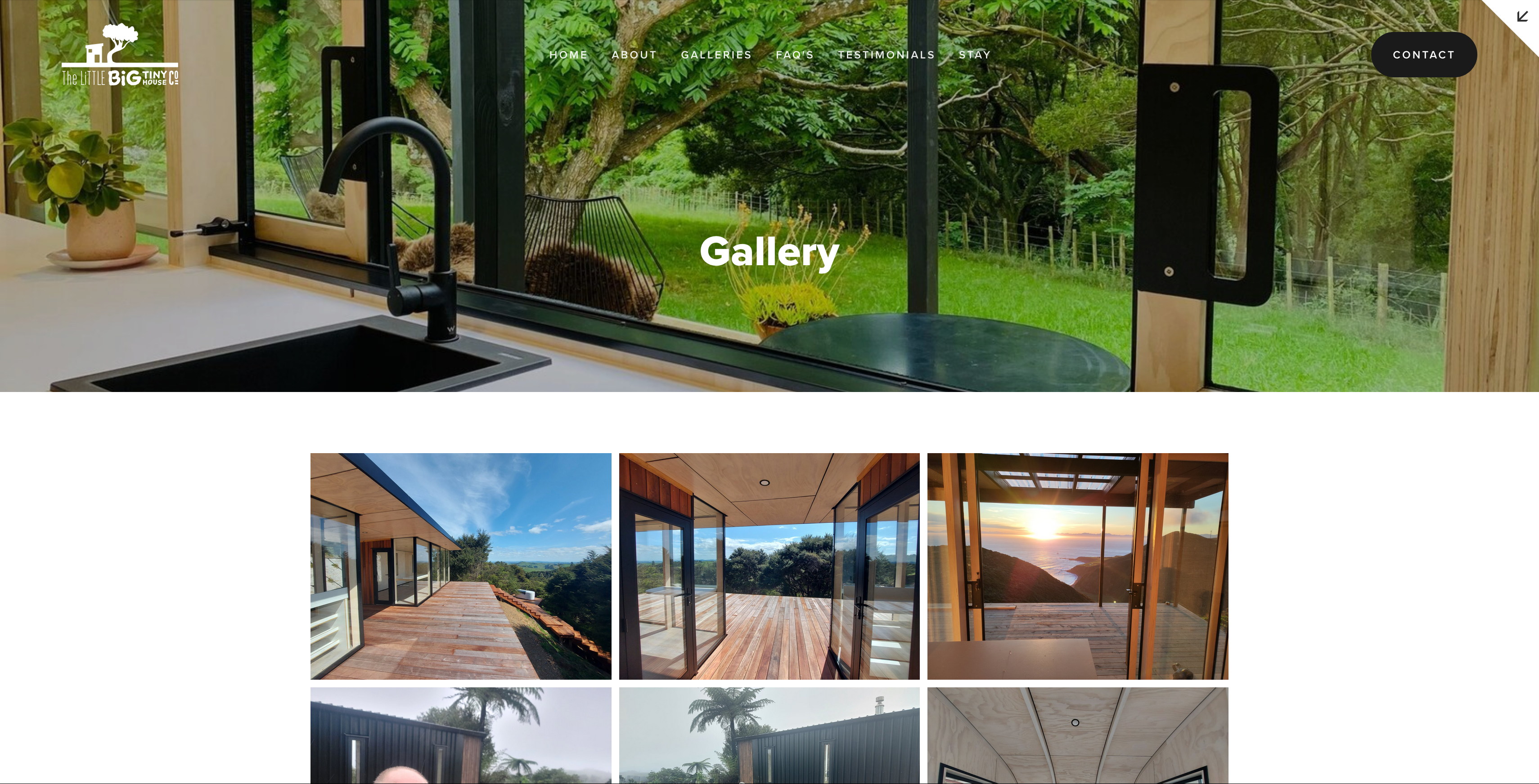
also on the home page, a more cohesive layout that better showcases The Little Big Tiny House Co.’s modular tiny homes:
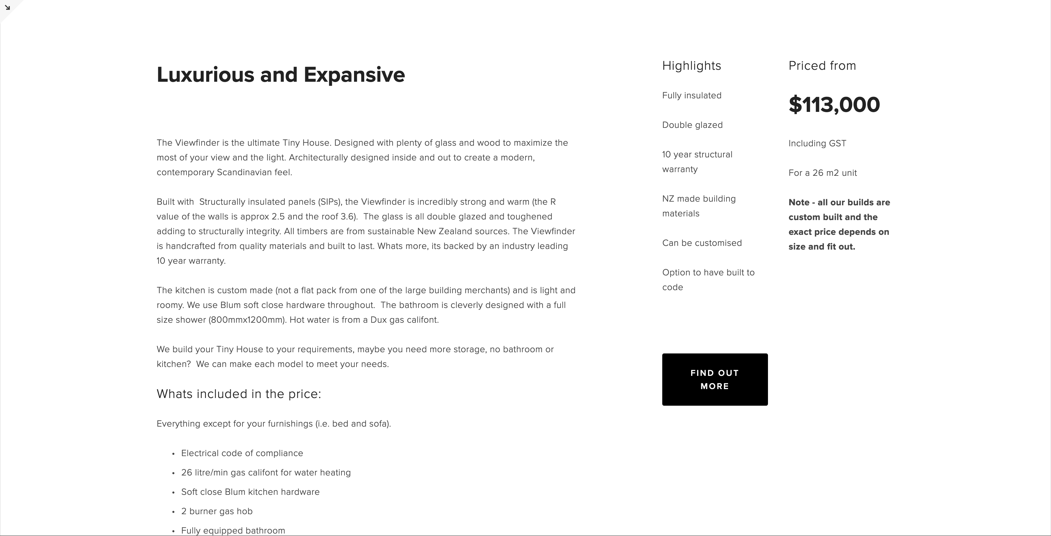
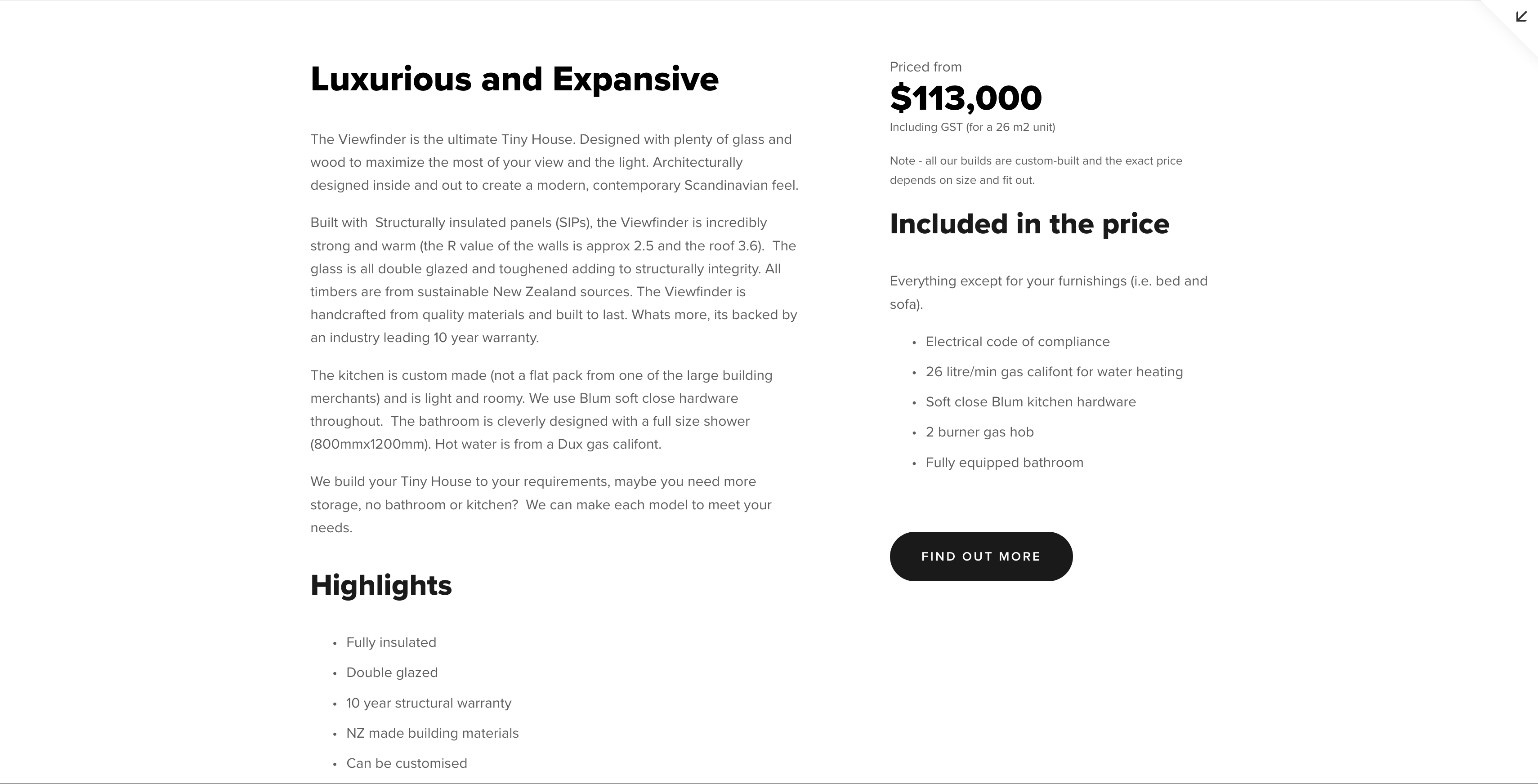
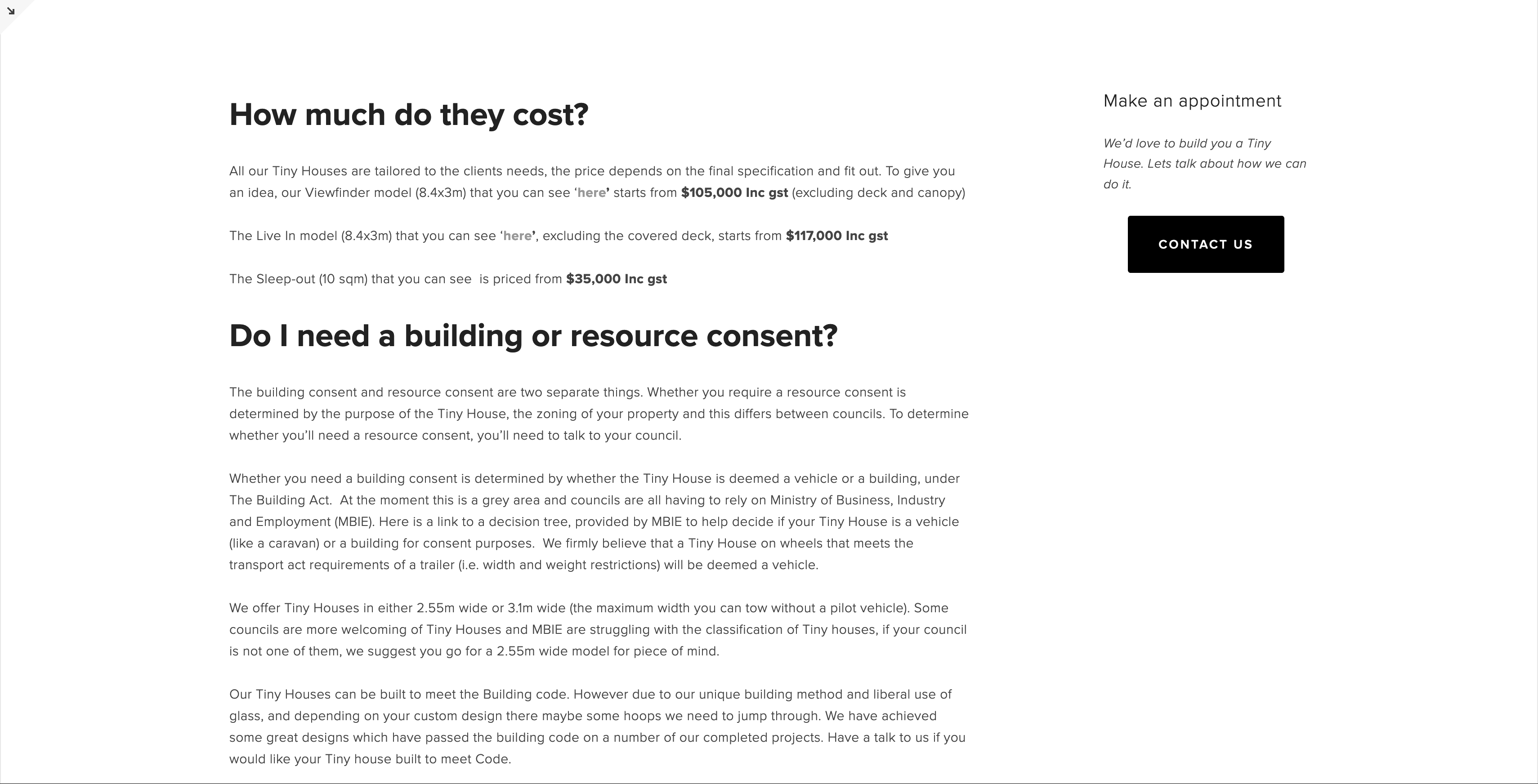
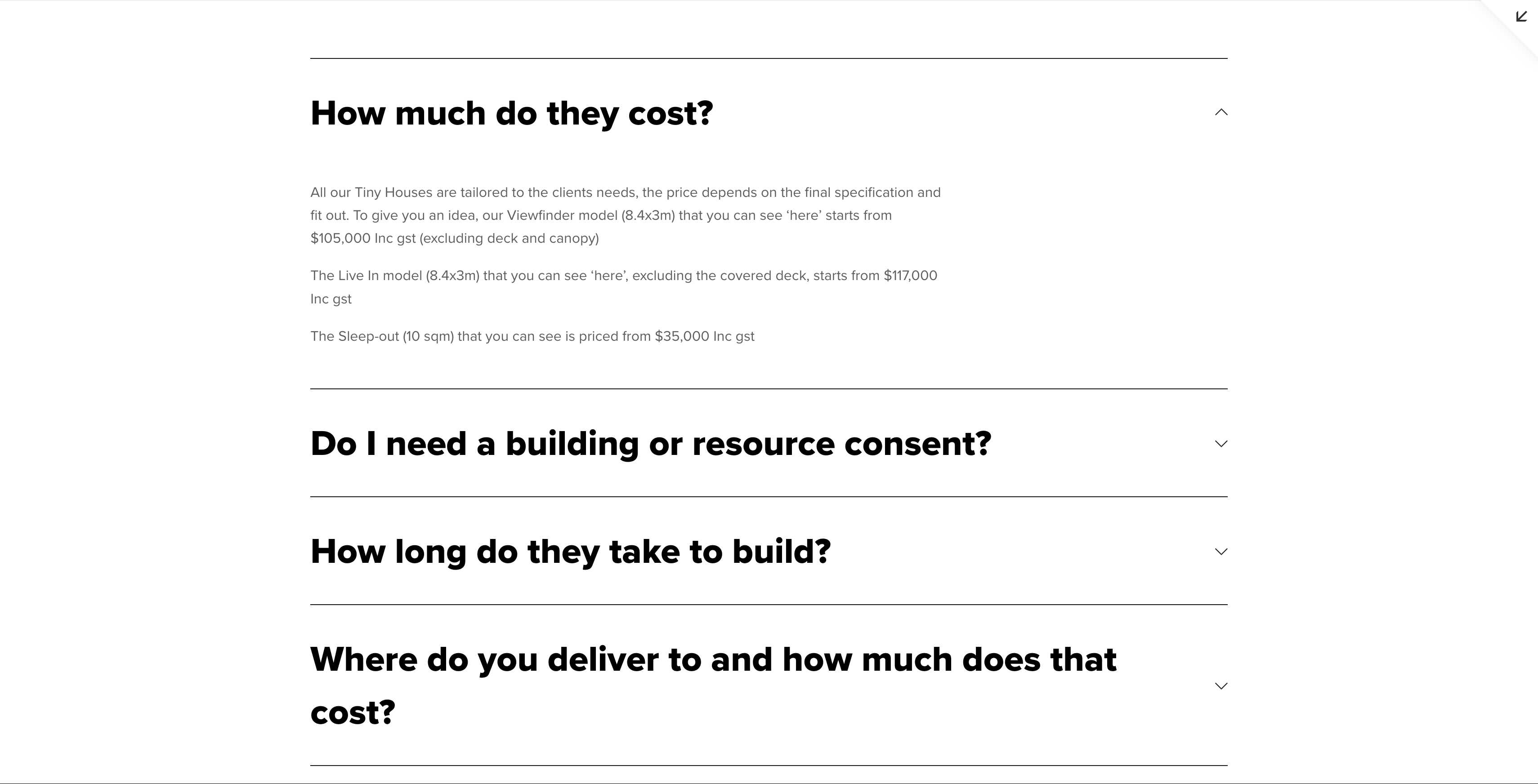
An updated design for the faq page that allows users to find answers quickly and easily:
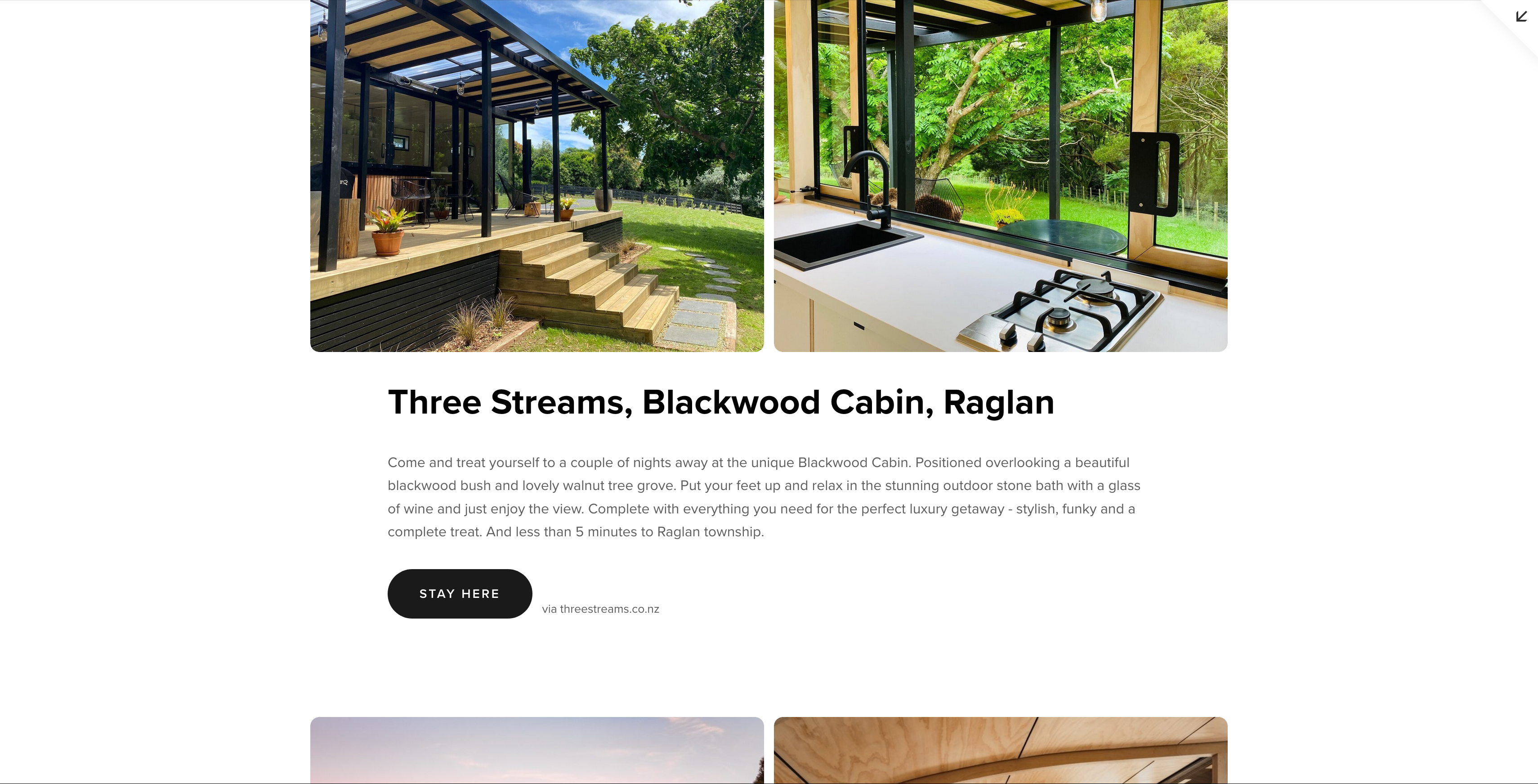
also a substantial overhaul to feature the tiny homes available for short stays via Airbnb and other platforms.


As you can see, thoughtful layout changes can significantly enhance the user experience of a website. The groundwork for a brand-new website is already in place, and I’m excited to share more about this in the near future.
