tracksuit
a trendy, fast, and fun website for Tracksuit, an award-winning New Zealand-based market research and brand tracking company, providing users with a dynamic design and seamless interface.
Webflow, figma, lottie, Javascript, jquery, Google Analytics
Preston Broad
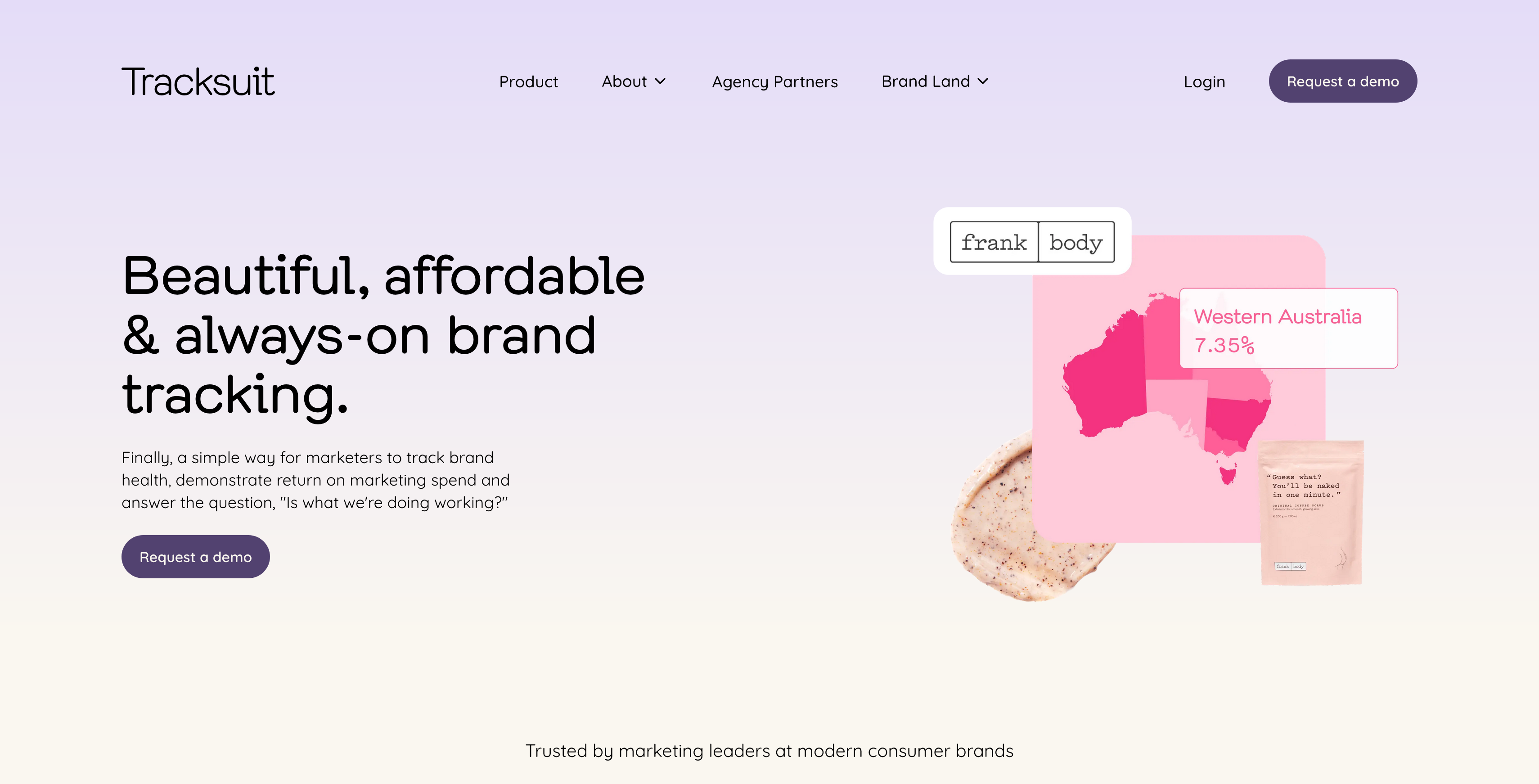
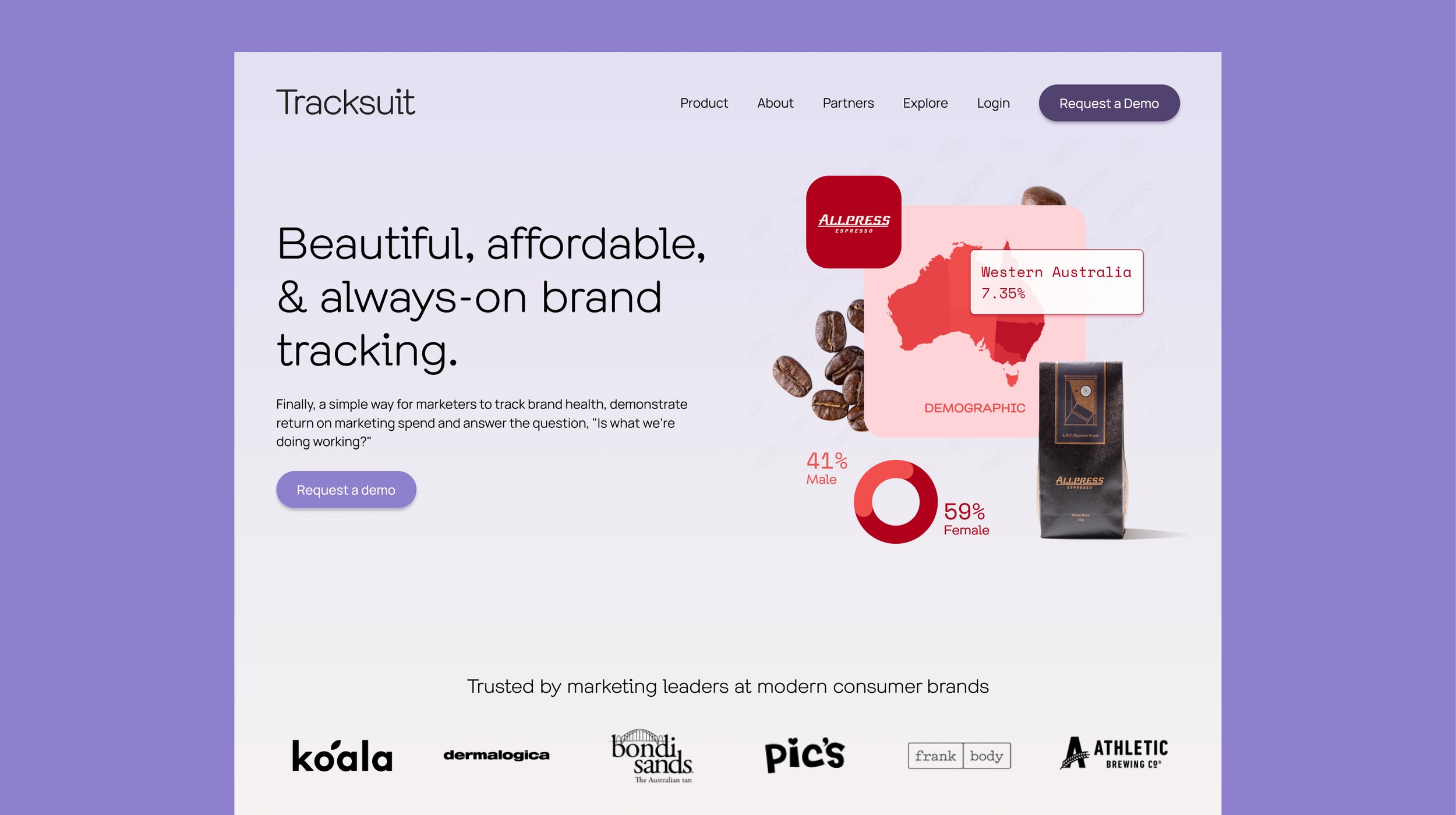
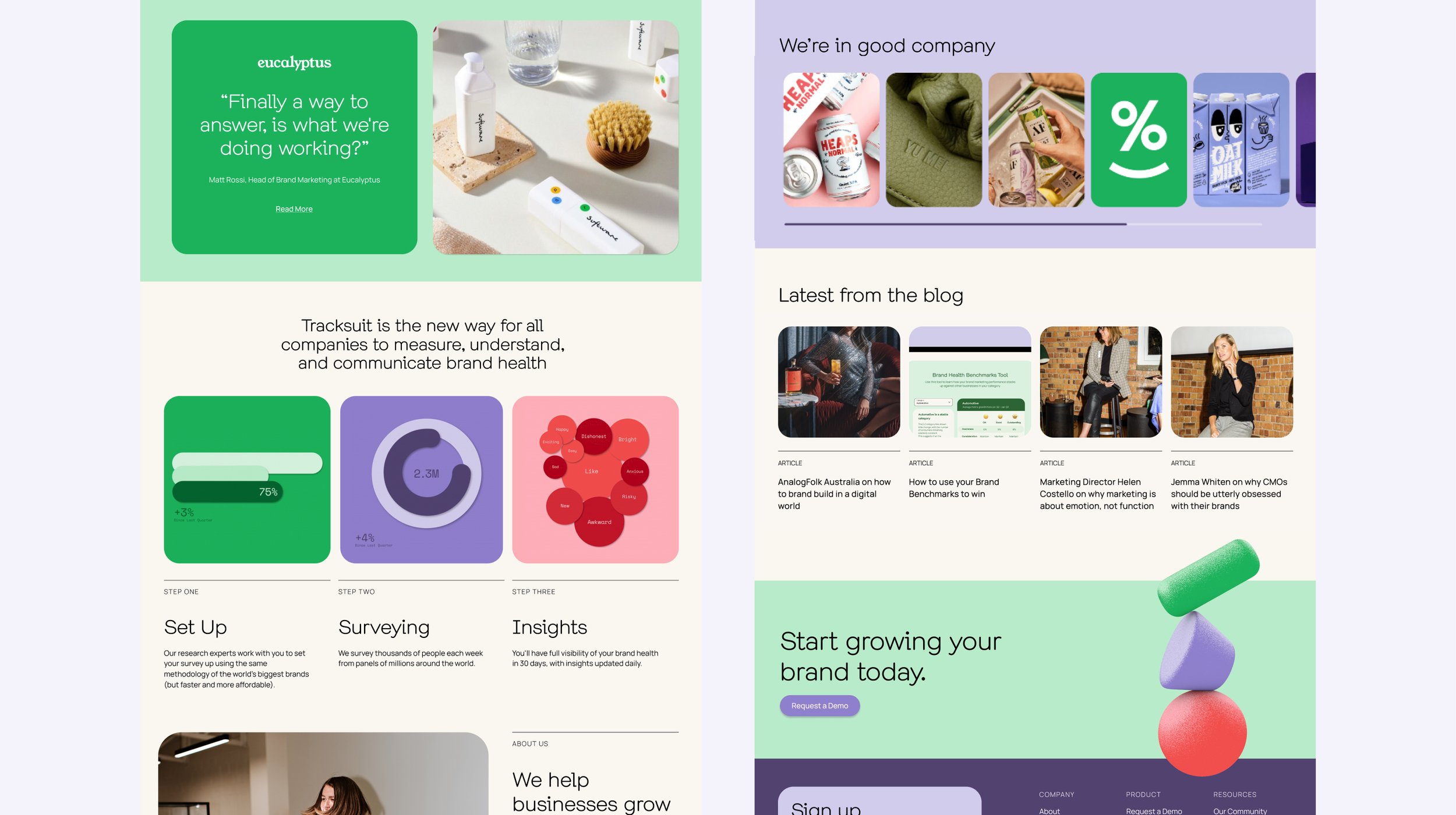
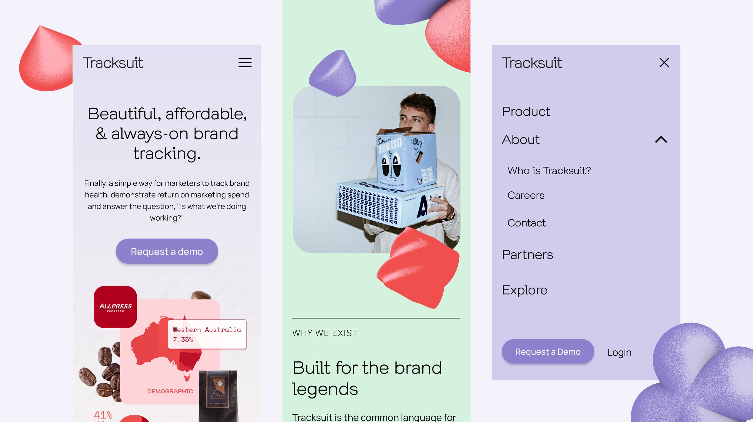
This was an incredibly fun project to work on, full of creative challenges and tight deadlines. The Tracksuit website underwent a significant transformation, with major updates to the homepage, about, careers, partners, and contact pages. The hero section became the centerpiece of the design, featuring a 3D animated graphic that dynamically showcased different brands every few seconds. Each brand was represented by five elements that animated in and out, creating a visually engaging experience. On desktop, the 3D effect was influenced by the user’s mouse position, adding an interactive layer to the experience.
You can see the 3D effect in action here:
In another part of the site, we faced challenges with large GIF files that were not only slow to load but also caused laggy animations, detracting from the overall user experience. To solve this, we took advantage of Webflow’s native Lottie support. By extracting the original animations, we were able to convert them into lightweight Lottie files, drastically reducing file size and eliminating performance issues. This change allowed us to achieve smooth, high-quality animations with complete control over animation timing and playback, resulting in a much more polished and responsive experience for users.
The design was masterfully crafted by Becca O’Shea, who focused on creating a component-driven layout. This approach ensured longevity and flexibility, allowing Tracksuit to easily update or add new pages using a variety of content blocks. Becca mentioned that the website had to complement the look and feel of the software while also reflecting the enthusiasm Tracksuit has for the brands they work with, making the project even more exciting to bring to life.
This project was particularly challenging due to the tight timeline—I had just three days to build the new pages before the raise announcement. It was a race against the clock, but the result was a sleek, modern website that met all the expectations.
You can read more about the raise announcement in this article: Tracksuit Raise Announcement 2023.
Although it looks like Tracksuit has since moved their website from Webflow to Sanity, working on this project was an awesome experience. The blend of tight deadlines, innovative design, and dynamic animations made it a standout project in my portfolio.